To me, art is a medium through which one expresses thoughts, ideas, emotions etc. One doesn't necessarily have to be good at it (I certainly am not compared to many of my classmates), but I think what's important is that one's artwork has a deeper meaning to it, and not just be drawn for the sake of drawing. (Yeah I might just be placing more importance on this to make up for my lack in artistic skill, haha).
To me, art has very subtle messages hidden in them. Each detail, be it from colour, composition, contrast or balance or anything else, is there because the artist intentionally put it there to tell viewers something. Change each detail and you could change the meaning of the work altogether.
To me, art is a gateway to my imagination. I make up my own characters, settings, costumes, stories, unique weapons from games or movies and other things and draw them out sometimes. Most of the time when that happens I only have access to pencils, which would explain why I don't do so well in other mediums.
To me, art relieves boredom. Big time. Even if it's only a minute or two of in-class doodling (haha, yes, I admit it), it takes my mind off things just enough for me to not go insane from information overload. It's a very relaxing form of recreation. The sense of achievement from completing an artwork and having it be admired by viewers is an added bonus.
To me, art is time-consuming. As much as I like it, I also find it unfortunate that I can only spare so much time from a busy schedule to hone my skills and develop my abilities. And thus I do not get very far from the limited amount of practice I get.
Wednesday, September 25, 2013
Monday, September 23, 2013
On Chuqiao's blog, I commented on her Great Ocean Road trip photos:
On Xin Jie's blog, I commented on her new shoes:
Nice contrast and picture quality! Especially the second one, silhouetting the tree branches with the sunset. Any more pictures of the trip?
http://happypencilowls.blogspot.sg/2013/09/photography-sunset.html?showComment=1379928439842
On Ying Ying's blog, I commented on her Coursework post:
Interesting that you decided to document your Coursework progress in a video! Could be longer though…
http://box4art2.wordpress.com/2013/09/14/结/comment-page-1/#comment-16
On Xin Jie's blog, I commented on her new shoes:
This is really nice! The designs are intricate and exotic. They fit in well with the rather “Indian” feel of the shoes. The sides and back look a little plain though…
Are you actually going to wear them? 
http://galiauxy.wordpress.com/2013/09/22/art-beyond-aep-design/comment-page-1/#comment-1
On Christine's Coursework post:
Interesting texture created by flicking the paint! Your idea of using marine creatures, too - they have unique body shapes and containers shaped as such would definitely be appealing to children. However, I think you could have used more arbitrary colours instead - like making the whale purple or something to make it more "kiddish" (quite a number of kids' shows do the same), and so that children will not mistake a real whale, turtle or octopus to be so small. If time allowed for more sculptures, then the more the merrier - I wanted to see more marine animals become waiters serving candy :/ Also, why marine animals and not land animals, for example?
http://hotchocolate-peppermintwhippedcream.blogspot.sg/2013/09/coursework.html?showComment=1380096578531
On Kathy's CCA T-shirt design post:
I like this! Especially the winking owl, and that you used different line thickness to make up for tonal values. HOOT! I loved the winking owl, too. But aside from the owl being sharp-eyed, like people in your CCA, a bit more relation on how it’s related to shooting would be nice.
http://skatches.wordpress.com/2013/03/22/right-on-target/comment-page-1/#comment-15
Surrealist Social Commentaries
(The term isn't real, I coined it.)
Dede Eri Supria is another of my inspirations; being in a country with many problems, but yet unable to express them too freely, he resorted to surrealism as a form of symbolism to depict these problems. An artwork that depicts a trend in a society is a social commentary, hence the term.
Works like "Labyrinth" are surreal, yet contain symbols like the cardboard boxes, homeless people and building scaffolds that represent the drawbacks of urbanisation and mass consumerism. He's probably going to get in trouble if he does a work about real people and their suffering.
In a way it's quite similar to my Coursework. I used a rather surreal (metaphorical if you will) setting to depict my theme about the strawberry generation and how they are educated.
Lucia Hartini, a Filipino artist, is similar to Dede in that she uses surrealism to express her frustration at her lowly status as a Christian woman in Indonesia, a Muslim-dominated country, except that she tackles more feminism-related issues in her works. I myself am a feminist, but she was not really an inspiration for my Coursework.
I like the sense of depth depicted in Dede's artworks; it really captures the essence of surrealism, as, like dreams, surrealism is vast and creative, not bound by the limits of the physical world.
Coursework cont.'d
The painting wasn't all. Oh no.
To explain it better I made a 'prototype model' of sorts to go with it.


 This is a model of the mask that "force-feeds" the human foetuses. The numbers on the label plate read:
2013
41331
2013's the year, of course. The numbers 41331 are a reference to myself.
I made the mask myself, using papier mache (did I spell that right?), lots of wire, some paint and a bit of aluminium foil.
The design is partly inspired by the masks of Bane, the Batman villain, and Darth Malgus from (of course) Star Wars.
And I have an instruction manual too! The Illustrator file is below. (please don't copy without permission though, 人家也要吃饭的咧.)

So that's pretty much the final piece of my Coursework.
Now for a description for the school exhibition!
GROWING THE FUTURE GENERATION
In Chinese there is a term, which, when literally translated, means "strawberry generation". It is an apt description of many youths today.
This is a satirical piece of work depicting the artist's view of youths of the current generation, herself included, and how school systems and the way they are educated may have had a part to play in it. Confined and sheltered to the point of spoon-feeding, many young people of today have lost self-initiative, independence and the motivation to learn. This work is a surreal, metaphorical depiction reminiscent of science fiction film The Matrix, with some hints of mass production and electrical appliances thrown in.
(Disclaimer: possible ranting and negative sentiments)
To explain it better I made a 'prototype model' of sorts to go with it.


2013
41331
2013's the year, of course. The numbers 41331 are a reference to myself.
I made the mask myself, using papier mache (did I spell that right?), lots of wire, some paint and a bit of aluminium foil.
The design is partly inspired by the masks of Bane, the Batman villain, and Darth Malgus from (of course) Star Wars.
And I have an instruction manual too! The Illustrator file is below. (please don't copy without permission though, 人家也要吃饭的咧.)

So that's pretty much the final piece of my Coursework.
Now for a description for the school exhibition!
GROWING THE FUTURE GENERATION
In Chinese there is a term, which, when literally translated, means "strawberry generation". It is an apt description of many youths today.
This is a satirical piece of work depicting the artist's view of youths of the current generation, herself included, and how school systems and the way they are educated may have had a part to play in it. Confined and sheltered to the point of spoon-feeding, many young people of today have lost self-initiative, independence and the motivation to learn. This work is a surreal, metaphorical depiction reminiscent of science fiction film The Matrix, with some hints of mass production and electrical appliances thrown in.
(Disclaimer: possible ranting and negative sentiments)
Wednesday, September 18, 2013
A galaxy far, far away...
Ralph McQuarrie was the main artist behind the scenes of my most favourite movie franchise, Star Wars. He was the mastermind behind many of the unique characters, weapons and equipment that make Star Wars so memorable.
What inspires me about him is not just his creativity and ingenuity, but also the fact that he went through several, if not a lot of designs and compositions, and put in a lot of effort in developing his ideas, making sure they were special and literally out of this world. Most of his ideas and sketches did not even make the final cut in the movies, but nevertheless displayed his thought and development processes that refine and improve a character to the one we know today.
Star Wars was the first science fiction movie to be filmed in a long time back in the 1970s, when the first movie debuted in theaters. As such, producers had to make sure it was special enough to make a lasting impression. They needed extraordinary, mind-blowing designs and ideas that represented the yet-to-come, that had never been seen before.
(PICTURE CREDITS FROM WOOKIEEPEDIA AND GOOGLE IMAGES)
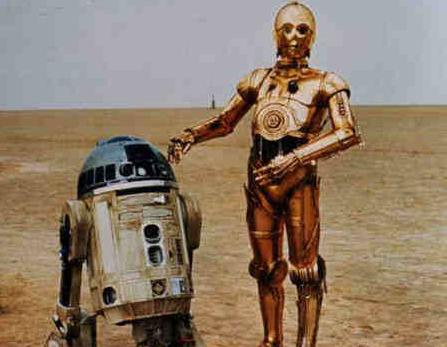
 Left: This was concept art he designed for the two robot sidekicks, C-3PO (the humanoid one) and R2-D2 (the short one in the background).
Below: The final design.

 This was concept art for Master Yoda. The variety in his designs remind me that as an artist, one must explore a wide variety of compositions and designs, and expect that some of them may not make the final cut.

Yoda eventually turned out like this in the film.
His artworks are not limited to just character design, but also scenery and composition.
 He invented the famous lightsaber, basing it off of weapons from medieval swordplay and ancient Eastern saber arts, and gave it a science fiction touch by creating the idea of it being a handle with a "blade made of pure energy that can cut through anything" and that can be turned on and off.
Sadly, Ralph McQuarrie passed away last year at the ripe old age of 82. He will be remembered by directors and fans alike as one of the greatest Star Wars artists in history.
What inspires me about him is not just his creativity and ingenuity, but also the fact that he went through several, if not a lot of designs and compositions, and put in a lot of effort in developing his ideas, making sure they were special and literally out of this world. Most of his ideas and sketches did not even make the final cut in the movies, but nevertheless displayed his thought and development processes that refine and improve a character to the one we know today.
Star Wars was the first science fiction movie to be filmed in a long time back in the 1970s, when the first movie debuted in theaters. As such, producers had to make sure it was special enough to make a lasting impression. They needed extraordinary, mind-blowing designs and ideas that represented the yet-to-come, that had never been seen before.
(PICTURE CREDITS FROM WOOKIEEPEDIA AND GOOGLE IMAGES)
Below: The final design.

Yoda eventually turned out like this in the film.
His artworks are not limited to just character design, but also scenery and composition.
Sadly, Ralph McQuarrie passed away last year at the ripe old age of 82. He will be remembered by directors and fans alike as one of the greatest Star Wars artists in history.
The others' e-portfolios!
For easy reference here are the links to my classmates' blogs:
2013 Sec 4 AEP E-portfolio
No
|
Name
|
The name that you would like your classmates to use in the link to your e-portfolio
|
E-portfolio Address
|
1
|
Tan Hui Ting
|
officialhuiting.blogspot.com
| |
2
|
Tan Huan Yu
| ||
3
|
Joey Goh
|
thatjoey.blogspot.com
| |
4
|
Agatha Tan
|
Agatha
|
threestepsfromquiet.tumblr.com
|
5
|
Hong Shu ying
|
AHMA:D
| |
6
|
Christine Yim
|
hotchocolate-peppermintwhippedcream.blogspot.com
| |
7
|
Choo Qing Yuan
|
Qing Yuan
|
box4art1.wordpress.com
|
8
|
Loh Ying Ying
|
box4art2.wordpress.com
| |
9
|
Pan Yining
|
Yining
|
box4art3.wordpress.com
|
10
|
Jane Zhao
|
简
|
box4art4.wordpress.com
|
11
|
Vivienne Kang Min
|
Vivienne
|
http://thetweedletweet.wordpress.com
|
12
|
Chuang Hui Yu
|
http://photokinesis.wordpress.com/
| |
13
|
Sherry Sun
|
Henry
|
http://dubiousink.tumblr.com/
|
14
|
Zhang Chuqiao
|
Chuqiao
|
happypencilowls.blogspot.com
|
15
|
Ang Cheng Hui
|
theOrange
|
http://indigoincandescence.wordpress.com
|
16
|
Chantel Foo
|
chantel
|
http://phantomic-alm.tumblr.com/
|
17
|
Liau Xin Jie
|
Xin Jie
|
galiauxy.wordpress.com
|
18
|
Kathy Poh
|
Kathy
|
skatches.wordpress.com
|
19
|
Yong Jia Xin
|
Jia Xin
|
http://padawanlearnerjax.blogspot.sg/
|
Sorry for not updating! (on a side note, here's what I did for Coursework)
I know, I know, it's been a while. I went MIA because I've been abducted by aliens. Okay, just kidding.
I've been doing research at a top-notch, top-secret science facility to come up with a product that can grow human beings. No, really.
 I did this painting for AEP Coursework, a major art project in which we can do a freelance artwork over half a year of any medium, of any theme (as long as it isn't too hard or impossible to do and as long as it doesn't need censoring).
It's my perception of the education system - that students are being mass produced inside a greenhouse, with rows of strawberry-shaped growth pods inside holding desks arranged in rows. They are connected to a main nutrient source (the huge grey metal-and-glass tank in the middle) by inlet pipes (shown in between the rows).
(WARNING - POSSIBLE RANTING AND SLIGHTLY EXTREME SENTIMENTS)
It's quite satirical, and I was hoping to convey my frustration about our generation being the "strawberry generation". According to our parents, youths born in the last two decades usually grow up in privileged families, and lead sheltered lives, thus leading them to become weak, pampered and in some cases unmotivated and lazy. They call us the "strawberry generation" in Mandarin, as we, like strawberries, cannot take pressure from the environment and are not hardy. Many youths of the 21st century have qualifications and "look good on paper", but are unable to handle the pressures of work and society when they leave school. This artwork suggests that the education system has a part to play in that too - that they are confining and protecting us (perhaps a bit too much), such that we become like strawberries. That is why the growth pods are strawberry-shaped, and I used red as a central color. Red also emphasizes the urgency of this issue, of course.
I've been doing research at a top-notch, top-secret science facility to come up with a product that can grow human beings. No, really.

It's my perception of the education system - that students are being mass produced inside a greenhouse, with rows of strawberry-shaped growth pods inside holding desks arranged in rows. They are connected to a main nutrient source (the huge grey metal-and-glass tank in the middle) by inlet pipes (shown in between the rows).
(WARNING - POSSIBLE RANTING AND SLIGHTLY EXTREME SENTIMENTS)
It's quite satirical, and I was hoping to convey my frustration about our generation being the "strawberry generation". According to our parents, youths born in the last two decades usually grow up in privileged families, and lead sheltered lives, thus leading them to become weak, pampered and in some cases unmotivated and lazy. They call us the "strawberry generation" in Mandarin, as we, like strawberries, cannot take pressure from the environment and are not hardy. Many youths of the 21st century have qualifications and "look good on paper", but are unable to handle the pressures of work and society when they leave school. This artwork suggests that the education system has a part to play in that too - that they are confining and protecting us (perhaps a bit too much), such that we become like strawberries. That is why the growth pods are strawberry-shaped, and I used red as a central color. Red also emphasizes the urgency of this issue, of course.
Tuesday, July 16, 2013
3rd June 2013: At Yishun CC....
On the way home from supplementary at school today I met my Mum for lunch, after which we walked home and decided to drop by the Community Centre in my neighbourhood. Apparently they were setting up an art exhibition by Yishun Town Secondary School's art CCA, and a good number of the works were Chinese Art, some of them paintings and some of them calligraphy. Some of them were done by Malay, Indian and even Filipino students! Being the noob I am at Chinese art I got some really helpful tips from their trainer, 曲茹老师, whose own works were on display there, and was probably feeling generous enough to give out some "trade secrets". (I took a few pictures)
As mentioned earlier there were pointers on how to create effects in Chinese ink painting. For example, one could save old calligraphy brushes with fuzzy, stiff split-haired tips, and use it to create fine lines placed closely together. Another tip was to save the water used to wash brushes in, as it is really just a more dilute version of the ink used, and this can be used to make lighter shades, like in the red blossom painting (she painted the branches at the back in a lighter shade to imply distance and add depth, and make it feel like one is really standing on the tree looking at the branches). The white feathers of the crane were made with white powder. As far as I know, Chinese ink does not usually use white ink like in Western painting.
For 山水画 (scenery paintings) or in fact any Chinese painting, she said, always, always draw the trees first. It sounds strange, doesn't it. I mean, in 山水画 where they depict breathtaking waterfalls and tall cliffs and mountain villages, it would be logical to do the cliffs first since they make the bulk of the painting and theoretically the trees and houses are only side details. But the actual logic behind this is that when the trees are done, we know where the roots are, and so we can pinpoint the location of the rocks of the cliff, and the houses, and so on. Furthermore the trees cover the rocks, so it would be more sensible to paint the rock around the tree root rather than paint the rock first and later go over with the tree.
From here on I'm just speculating, and making generalisations on what I saw today. If those are not real aspects of Chinese painting please correct me!
This is not Western painting, where one can always cover up mistakes with more layers of thick modelled paint. Chinese ink has a different chemical composition being a completely different material, and if the ink is not black it is usually translucent when dry. Hence we can't do it like Edouard Manet and his "A Bar at the Folies-Bergere" (he painted the waitress at the bar four times over because he kept changing his mind about where she should be in the composition).
Another point about painting trees first: when doing a close-up composition like the work with the cranes, or with the red blossoms, the branches of the tree provide direction and movement and a general structure of how your composition is supposed to look like. The trainer painted the branches of the tree first, then added the side details like the flowers or the cranes.
One more thing I noticed about the paintings: there was hardly any modelling of brushstrokes. I guess that is not very possible when working with dilute ink. Gradients and shadows (or light and dark areas) are created using intensity of line thickness and spacing in the crane painting, like cross-hatching (except with curves). In the red blossom painting texture on the branches was created by a half-dry brush (where you dip the brush in the ink, then wipe it on another surface until only some of the ink is left and the brush feels relatively dry, creating a patchy effect that also gives the grey areas). The lighter areas of the branch were highlighted with the roughly-painted line with varied thickness that looks arbitrary but somehow enhances the organic form of the branch.
A lot of times, white areas in Chinese painting are represented by negative space, since there isn't any white ink like there is white paint. For subjects like water bodies strokes of dilute colour must be added to depict current and waves. Most of the rest I learnt is about brush manipulation; the cranes' legs were done entirely using brush, and so were the stamens and pistils of the red flowers. (It looks too perfect to have been done by brush, doesn't it?)
Looking at the caption made me remember another Chinese saying:
Our conversation today was only ten minutes long, but very educational. I learned from a true master.
That leads me to another question: how come Nanyang's a Chinese school yet we don't have Chinese art in our AEP syllabus?
As mentioned earlier there were pointers on how to create effects in Chinese ink painting. For example, one could save old calligraphy brushes with fuzzy, stiff split-haired tips, and use it to create fine lines placed closely together. Another tip was to save the water used to wash brushes in, as it is really just a more dilute version of the ink used, and this can be used to make lighter shades, like in the red blossom painting (she painted the branches at the back in a lighter shade to imply distance and add depth, and make it feel like one is really standing on the tree looking at the branches). The white feathers of the crane were made with white powder. As far as I know, Chinese ink does not usually use white ink like in Western painting.
For 山水画 (scenery paintings) or in fact any Chinese painting, she said, always, always draw the trees first. It sounds strange, doesn't it. I mean, in 山水画 where they depict breathtaking waterfalls and tall cliffs and mountain villages, it would be logical to do the cliffs first since they make the bulk of the painting and theoretically the trees and houses are only side details. But the actual logic behind this is that when the trees are done, we know where the roots are, and so we can pinpoint the location of the rocks of the cliff, and the houses, and so on. Furthermore the trees cover the rocks, so it would be more sensible to paint the rock around the tree root rather than paint the rock first and later go over with the tree.
From here on I'm just speculating, and making generalisations on what I saw today. If those are not real aspects of Chinese painting please correct me!
This is not Western painting, where one can always cover up mistakes with more layers of thick modelled paint. Chinese ink has a different chemical composition being a completely different material, and if the ink is not black it is usually translucent when dry. Hence we can't do it like Edouard Manet and his "A Bar at the Folies-Bergere" (he painted the waitress at the bar four times over because he kept changing his mind about where she should be in the composition).
Another point about painting trees first: when doing a close-up composition like the work with the cranes, or with the red blossoms, the branches of the tree provide direction and movement and a general structure of how your composition is supposed to look like. The trainer painted the branches of the tree first, then added the side details like the flowers or the cranes.
One more thing I noticed about the paintings: there was hardly any modelling of brushstrokes. I guess that is not very possible when working with dilute ink. Gradients and shadows (or light and dark areas) are created using intensity of line thickness and spacing in the crane painting, like cross-hatching (except with curves). In the red blossom painting texture on the branches was created by a half-dry brush (where you dip the brush in the ink, then wipe it on another surface until only some of the ink is left and the brush feels relatively dry, creating a patchy effect that also gives the grey areas). The lighter areas of the branch were highlighted with the roughly-painted line with varied thickness that looks arbitrary but somehow enhances the organic form of the branch.
A lot of times, white areas in Chinese painting are represented by negative space, since there isn't any white ink like there is white paint. For subjects like water bodies strokes of dilute colour must be added to depict current and waves. Most of the rest I learnt is about brush manipulation; the cranes' legs were done entirely using brush, and so were the stamens and pistils of the red flowers. (It looks too perfect to have been done by brush, doesn't it?)
Looking at the caption made me remember another Chinese saying:
诗中有画,画中有诗. I asked the teacher what that was all about, and she said that some poems, like 春晓 (a classic) were written when poets looked at artworks done by masters and wrote poems based on that; and in turn when anyone looks at those poems they would be able to metaphorically conjure the imagery such that it looks like a painting, or vice versa - looking at the painting reminds them of the poem. (and here I was thinking people like
李白 got inspiration from real first-hand experience.)
That leads me to another question: how come Nanyang's a Chinese school yet we don't have Chinese art in our AEP syllabus?
15th July 2013: LaSalle Exhibition
Exhibits of works from AEP students from many schools. Mrs. Tan said it was to "set the benchmark" for our Coursework quality. The works were really mind-blowing!
It makes me wonder how much time they spent on it, and how long they spent to create works of such high quality. We only had about an hour to browse works though, so
I'm gonna feature some of my favourites in this post, so it could get a bit long.
The pics aren't of very good quality though...

 PERSONAL REFLECTIONS OF A LITTLE EMPEROR
This one, by Jiang Wenhuan of National Junior College, is a rather social commentary-style piece describing the "little emperors" caused by China's one-child policy, though the setting is a little more surrealistic like Lucia Hartini's works.
There are some hidden references in the work (the most obvious one being the emperor's throne). Up in the top background there are ancient-style line drawings of ancient Chinese people (philosophers?) which I think may represent the ancient Confucian values of moral aptitude, respect for parents etc which the artist may think is being thrown away in today's society. The right arm of the throne is a dragon, while the left is a worm (Ms. Xie pointed that out). There are two rats near the subject matter's right foot (possibly his parents...?)
This piece hits home for me; even though I'm not a male only child spoiled by his parents, I can roughly guess how terrible parents would feel with a spoilt child, especially when the child grows up...
 TWO-FACE
Done by Melvin Koh of Nanyang Junior College, it's quite light-hearted. Literally.
Even though there isn't a very philosophical message behind it, it was still very clever.
 There are two lamps on either side that turn on and off alternately. Here's what happens when the left lamp's lit...
And here's what happens when the right one's lit.
Made using a large board with pieces of paper of different sizes stuck upright on them.
(Take that, Batman!)
And my most favourite...
THE FACTS OF FICTION
This one is very professional. Natural history re-written, by Tan Yui Wei of Nanyang Junior College.
The whole installation's like a small museum on its own, in a small corner of the exhibition hall. This artist invented her own species by combining plant and animal species. She also hand-crafted fossils using ceramics (the bones were so life-like I almost thought they were real until I saw remaining fingerprints). Then she wrote blueprints of creature designs, with species family trees, chromosome pairings (using purple colour pencils) and made insects out of withered leaves.


It makes me wonder how much time they spent on it, and how long they spent to create works of such high quality. We only had about an hour to browse works though, so
I'm gonna feature some of my favourites in this post, so it could get a bit long.
The pics aren't of very good quality though...


This one, by Jiang Wenhuan of National Junior College, is a rather social commentary-style piece describing the "little emperors" caused by China's one-child policy, though the setting is a little more surrealistic like Lucia Hartini's works.
There are some hidden references in the work (the most obvious one being the emperor's throne). Up in the top background there are ancient-style line drawings of ancient Chinese people (philosophers?) which I think may represent the ancient Confucian values of moral aptitude, respect for parents etc which the artist may think is being thrown away in today's society. The right arm of the throne is a dragon, while the left is a worm (Ms. Xie pointed that out). There are two rats near the subject matter's right foot (possibly his parents...?)
This piece hits home for me; even though I'm not a male only child spoiled by his parents, I can roughly guess how terrible parents would feel with a spoilt child, especially when the child grows up...

Done by Melvin Koh of Nanyang Junior College, it's quite light-hearted. Literally.
Even though there isn't a very philosophical message behind it, it was still very clever.
 There are two lamps on either side that turn on and off alternately. Here's what happens when the left lamp's lit...
And here's what happens when the right one's lit.
Made using a large board with pieces of paper of different sizes stuck upright on them.
(Take that, Batman!)
And my most favourite...
THE FACTS OF FICTION
This one is very professional. Natural history re-written, by Tan Yui Wei of Nanyang Junior College.
The whole installation's like a small museum on its own, in a small corner of the exhibition hall. This artist invented her own species by combining plant and animal species. She also hand-crafted fossils using ceramics (the bones were so life-like I almost thought they were real until I saw remaining fingerprints). Then she wrote blueprints of creature designs, with species family trees, chromosome pairings (using purple colour pencils) and made insects out of withered leaves.


Apologies for the crappy arrangement, I have major problems toggling pics on Blogger.
Tuesday, July 2, 2013
2nd July 2013: Post-Museum Promotional Post!
Today for Special Inerest Learning (that's SIL, a special kind of assembly thing where speakers from different fields come to give talks). This week we had an artist from the non-governmental organisation Post-Museum. Her name was Jennifer (I can't remember her surname), and she was a personal friend of Mr. Chang's.
Post-Museum is a congregation of artists that focus on projects that encourage proactivity among Singaporeans. It used to operate out of 2 adjacent shophouses at Rowell Road (a brothel district), until the place closed in 2011. So now they are "roaming", using whatever spaces are available islandwide to carry out their projects.
Miss Jennifer isn't an artist in the orthodox sense - she doesn't do installations or paintings, though the old place was used for art exhibitions. Some of her projects are interesting and really gets the public involved, and all of them are non-profit, like "Awaken the Dragon", and "Singapore Really Really Free Market", and another one to promote awareness about the Bukit Brown Cemetery which is going to be flattened for a highway soon. Here's their website for more details:
http://www.post-museum.org/
I find this approach to art rather interesting, even though it deviates away from traditional methods of producing art (which was to do it by your own artistic abilities and efforts). It's more of amassing members of the public to help in a project, then letting the project take its own course, just like in the DADA art movement where some artworks were determined by chance.
A classmate asked about how she got the funding; most of her projects were free, but for those that needed funding she applied to organisations like the Singapore Arts Council.
I managed to catch up with her after the talk (and missed a few minutes of lesson, ha ha) and had a short chat and asked a few questions, like what became of the dragon kiln that was supposed to have closed down if not for her project "Awaken the Dragon", to which she replied that the project would be continued the next year. I salute her creativity, and perseverance as even she herself stated that "logistics was a nightmare" for the project - I still lack the tenacity to carry out, let alone lead an operation of this magnitude. When I asked her if it was hard to gain public support, she said that in fact many people were enthusiastic to join projects like "Awaken the Dragon". That surprised me, since I thought Singaporeans like myself would usually reject doing projects that "waste time" or "are not productive or mainstream".
It seems that people in Singapore can be proactive after all - they just need someone special and creative to start the ball rolling.
Wednesday, May 22, 2013
22nd May's lesson
Pretty interesting lesson today. Discussed some really avant-garde works, like Catherine by Sean Scully, The Carpet Told Me by Jeroen Kooijmans and Radioactive Cats by Sandy Skoglund.
I like Mrs. Tan's methods of teaching here - she lets us use our gut instinct on only seeing the artwork, sometimes even without the title, year or any kind of contextual knowledge, and really put our interpretation skills and creative juices to the test. Only when we cannot squeeze out any more will she explain the background of the artwork, and even then the artist's intentions are not explicitly stated.
WARNING: THE FOLLOWING IS ONLY SPECULATION DONE BY AN AMATEUR. DON'T TAKE IT AS A SERIOUS TEXTBOOK DEFINITION OR...if you do don't blame me if you write this as an analytical report and fail terribly.
Apparently, "Catherine" was about the artist's relationship with his wife called, um, Catherine. (Go Google the artwork for an image.) After much deliberation it was finally revealed that what was shown as a whole picture...was actually two separate canvases placed side by side. Some of us interpreted each canvas as representative of Sean and Catherine as individuals "fused" through marriage, others (like myself) thought of the left canvas as the early stages of marriage (since usually a bride wears white and a groom wears black, and they are opposites on the colour wheel so they are probably vastly different because they haven't rubbed off on each other enough yet) and the right side as the later stages (red symbolizing more passion, anger etc).
 Erm, haha. Ahem.
The Carpet Told Me was done in response to 9/11. The poor artist witnessed the whole thing from his apartment. Again, his intentions were not explicitly stated, but all of us agreed that the serenity depicted was a stark contrast to the incident itself. So the general idea was along the lines of "Keep Calm and Carry On." The work was done six years after, so it also had a sense of "accepting and moving on".
Finally, Radioactive Cats. Mrs. Tan got us to write a short story from the perspective of one of the elements in the artwork, be they the cats, the woman or the elderly man. That was a fun activity, hearing different perspectives from different people.
None of these artworks had a specific meaning or concrete message to them, which allowed for free interpretation. It could be a good thing, since people relate different elements in artworks to different things, like how I related Radioactive Cats to be the aftermath of a nuclear plant leak and the affected residents nearby, while some others in my class thought of the cats to be a figment of the old man's imagination and that he was going insane.
But some artworks out there are left untitled. Absolute free expression, but no guide to your thoughts, which may not be a good thing especially if viewers end up thinking in the wrong direction from what the artist wants to convey.
I like Mrs. Tan's methods of teaching here - she lets us use our gut instinct on only seeing the artwork, sometimes even without the title, year or any kind of contextual knowledge, and really put our interpretation skills and creative juices to the test. Only when we cannot squeeze out any more will she explain the background of the artwork, and even then the artist's intentions are not explicitly stated.
WARNING: THE FOLLOWING IS ONLY SPECULATION DONE BY AN AMATEUR. DON'T TAKE IT AS A SERIOUS TEXTBOOK DEFINITION OR...if you do don't blame me if you write this as an analytical report and fail terribly.
Apparently, "Catherine" was about the artist's relationship with his wife called, um, Catherine. (Go Google the artwork for an image.) After much deliberation it was finally revealed that what was shown as a whole picture...was actually two separate canvases placed side by side. Some of us interpreted each canvas as representative of Sean and Catherine as individuals "fused" through marriage, others (like myself) thought of the left canvas as the early stages of marriage (since usually a bride wears white and a groom wears black, and they are opposites on the colour wheel so they are probably vastly different because they haven't rubbed off on each other enough yet) and the right side as the later stages (red symbolizing more passion, anger etc).
The Carpet Told Me was done in response to 9/11. The poor artist witnessed the whole thing from his apartment. Again, his intentions were not explicitly stated, but all of us agreed that the serenity depicted was a stark contrast to the incident itself. So the general idea was along the lines of "Keep Calm and Carry On." The work was done six years after, so it also had a sense of "accepting and moving on".
Finally, Radioactive Cats. Mrs. Tan got us to write a short story from the perspective of one of the elements in the artwork, be they the cats, the woman or the elderly man. That was a fun activity, hearing different perspectives from different people.
None of these artworks had a specific meaning or concrete message to them, which allowed for free interpretation. It could be a good thing, since people relate different elements in artworks to different things, like how I related Radioactive Cats to be the aftermath of a nuclear plant leak and the affected residents nearby, while some others in my class thought of the cats to be a figment of the old man's imagination and that he was going insane.
But some artworks out there are left untitled. Absolute free expression, but no guide to your thoughts, which may not be a good thing especially if viewers end up thinking in the wrong direction from what the artist wants to convey.
Monday, May 20, 2013
Project 11 (2011)
Designed this poster in Sec 2 for a CCA-related project called Project 11. We were supposed to collect ring tabs from aluminum food and drink cans and donate them so they could be recycled to make prosthetic limbs for disabled children. From the pencil sketch to the traced copy to the colored version!


Earth Hour 2010


These Earth Hour posters were done in 2010, when I was in Sec 1 and my CCA needed someone to design a poster for the event. My original idea was in white, like the one on the right, but upon consultation with the Sec 3 seniors, one of whom was in AEP and whom suggested I do something like that in black, to encapsulate the "switching off lights" idea.
Here's the original design. Scanner was a bit too bright.

Nice scenery! (Taken May 8, 2013)

Was running one day, and listening to music, which meant I happened to have my phone with me. Looked up at the sky, and snapped this.
The effect was not quite what I expected, but it's good!
This being my last year in Nanyang and all, I should have some good memories of this place.
I also happened to take this picture during a time when I was getting back block test papers (getting back exam papers is one of my least favorite things). This picture served to cheer me up, in a way. I mean, who doesn't like nice sceneries, right?
Korra sculpture


I did this clay sculpture last year, since we did this clay project and I happened to have a chunk of clay left over. It's not very big (as can be seen from the pencil holder in the back), and it's one of my first sculptures with a human subject matter so please no bashing!
This might look familiar to fans of the Nickoodeon series "The Legend of Korra". Yes, this is Korra, the main protagonist of a story set in a world where some people are able to control, or 'bend' either one of four elements: water, air, earth and fire. Her main element is water, but she happens to be a special 'chosen one' with the ability to manipulate all four, known as an Avatar. The Avatar's duty is to maintain balance in the world (since benders of the four different elements may not always be on good terms). Once the current Avatar passes away he/she will be reincarnated, and the cycle repeats itself. It is quite a task for a seventeen-year-old girl like herself.
The show itself is a sequel series to "Avatar: The Last Airbender", in which the protagonist was an airbender named Aang, who reincarnated into Korra. I happened to finish watching the first season of "Korra" and got inspired to do this. I know I've stated before that this is not a DeviantArt account, but fan art like this is worth posting to me.
Wednesday, April 10, 2013
10 April 2013
Had a rather fruitful discussion today, one that went from Han Sai Por's works to complaining about the education system. Long story, I know, but it went something like this:
While discussing her opinions on art, the class commented that she was contradicting herself; I know it sounds cynical but it seemed like she was "giving the politically correct answer" (something along those lines). How she was saying at first that she does not impose her ideas on the materials and environments she uses and the target audience she tries to reach out to (which is usually the public); in fact she says she creates sculptures that "the public wants"; yet she also mentioned something about "staying true to" herself. And then, speaking of "politically correct" answers, we started talking about graded assignments, some of which required our "opinions" but then "told us which opinions were right, or as they put it - to get a safer grade". (like the Integrated Humanities Reflection we did on our project work last year which required 6 pages of reflections from us then gave us a whole list of guidelines telling us what to write. They wanted an 'academic essay' on our experiences, not a personal narrative - I only made it to 4 pages. On the topic of 私函 or functional letter writing in Chinese - a constant exercise we've been doing for Higher Chinese, involving a rigid structure and format not just in writing recipients' and senders' addresses but also in the content of the letter - someone even commented that we sure as heck don't need no dang format to write to our friends!) And we all started joking about the irony.
Perhaps as artists we prefer free expression, but then again, the education system in its current state doesn't allow for that. Looking at Sticker Lady and our art museums, maybe the country in its current state was not meant for artistic expression.
Wednesday, April 3, 2013


Take note!
This is an art blog, so according to the rubrics there should be academic content here as well as various artworks I've done, or seen and thought interesting enough to put here.
Just a note, most of the artwork I've done that is good enough to be seen is fan art, so I apologize beforehand if it may not seem relevant. I'll try my best not to turn it into a DeviantArt page though.
Please, please leave comments on posts you've looked through! I work better with constructive feedback!
Please, please leave comments on posts you've looked through! I work better with constructive feedback!
3 April 2013
Yeah, sorry for not posting recently, I was bogged down with stuff.
Today's AEP lesson was a theory lesson, where this quote by Han Sai Por was raised, and there was this line in the quote, "If the artist says, this is art, then it is art, provided only that the artist can demonstrate a valuable idea or concept." I find that I can connect with this line the most, especially after learning about Dadaism. This art movement really made me question the definition of art. It made no sense and almost seemed like a joke to me, until I found out its background story. That cleared up the doubt. That art movement was created around the World War I era, and the artists wanted to mock society for losing its fundamental values and letting themselves get dragged into conflict, which reflects the nonsensical, random qualities about the movement
The ensuing discussion made me realize that novelty, or ingenuity is also a key part to artworks, like if artists were breaking new ground. If someone else tried to copy it it would not be as original.
Learning from various art movements made me learn that art does not necessarily have to be aesthetically pleasing and always follows the artist's intention (which may vary depending on if it's commissioned, of course).
There's this satirical cartoon, The Pinky Show, where on one episode the cartoon characters talked about museums, who decides what goes in museums, why they think it's important and so on. It had a sarcastic tone, suggesting that museums are formal, academic and like some sort of temple where people "worship" artworks.
Tuesday, February 26, 2013
Hello world!
Well this is awkward.
To be honest I'm not too familiar with using blogs like this so it will take a while for me to learn the ropes. Till then excuse the noobness.
About this place: I'm using it for art stuff, specifically e-portfolio for AEP. So it's not going to be cluttered with only random pieces of fan art from my notes at school out of boredom. This isn't DeviantArt. (no I don't have one)
Subscribe to:
Comments (Atom)